The MDX component set for Halentra's long-form content. Copy a block, fill in the content, keep the rhythm.
Default paragraph, bold and link styling, applied automatically to every MDX document through the shared Prose wrapper.
Body copy runs on a comfortable line height so long explanations stay easy to follow. Inline emphasis stays semantic and quiet, and a link looks like this one, styled through the shared text-link component rather than one-off inline styles.
Body copy runs as plain Markdown. Use **bold** for
semantic emphasis and [a link](/demo) for anything clickable.Three tones are wired up today: a soft mint box for general notes, a dark panel for anything readers must not skim past, and a light surface box for questions that deserve a pause.
Rates are set per user, per month. Devices sit on their own line so growth stays visible.
Never write “unlimited” into a contract. It is not a commercial term, it is a bet you lose on the worst possible week.
Is this block the right container for a question? Use it when you want the reader to pause and actually answer before moving on.
<Callout label="Note" tone="info">
  Rates are set per user, per month.
</Callout>

<Callout label="Heads up" tone="danger">
  Never write "unlimited" into a contract.
</Callout>

<Callout label="Question" tone="question">
  Is this block the right container for a question?
</Callout>labelstringtone"info" | "danger" | "question"default "info"childrenReactNode<Cta
title="Ready to see it on your own data?"
subtitle="30 minutes, no slides."
primaryLabel="Book a demo"
primaryHref="/demo"
secondaryLabel="See pricing"
secondaryHref="/solutions"
/>titlestringsubtitlestringprimaryLabelstringprimaryHrefstringsecondaryLabelstringsecondaryHrefstringThe secondary button only renders when both secondaryLabel and secondaryHref are set.
Renders full width by default, opens a full-screen lightbox on click, and preloads on hover so the transition feels instant.
<MediaImage
  src="/assets/hudu/hero.webp"
  alt="Example product screenshot"
  maxWidth={360}
/>srcstringaltstringmaxWidthnumberCaps the rendered width in px. Full width when unset.
A discount is a price change. An exception is a scope change. Confusing the two is how margins disappear quietly.
<PullQuote
  text="A discount is a price change."
  name="Marc Aubert"
  role="Halentra"
/>textstringnamestringrolestringWe stopped rebuilding quotes in a spreadsheet. Three tiers went into the PSA and renewals took half the time they used to.
<Quote
  text="We stopped rebuilding quotes in a spreadsheet."
  name="Sarah Lindqvist"
  role="Operations lead, Northbound IT"
/>textstringnamestringrolestring<DataTable
columns={["Tier", "Coverage", "What it includes"]}
rows={[
["Essential", "Business hours", "Patching, monitoring, service desk."],
]}
/>columnsstring[]widthsstring[]CSS grid track sizes, one per column. Defaults to an equal 1fr per column.
rowsReactNode[][]Yes. Every block below is a standalone MDX component, so an article can move from prose to a callout to a table without any special wiring.
Use the closest available block, or ask engineering to add it. Every block the design calls for is rendered and documented on this page.
<Faq
  items={[
    { q: "Can I mix components?", a: "Yes, freely." },
  ]}
/>items{ q: string; a: string }[]<KeyNumbers
items={[
{ value: "12", label: "components live today" },
]}
/>items{ value: string; unit?: string; label: string }[]Plain prose first, blocks added only where they earn their place.
Callouts for asides, a table for anything tabular, a quote where it's earned.
The Prose wrapper keeps typography consistent across every collection.
<Timeline
  steps={[
    { period: "Step 1", title: "Write the draft", desc: "Plain prose first." },
  ]}
/>steps{ period: string; title: string; desc: string }[]Clients forgive increases. They do not forgive surprises.
<StatementBanner
  text="Clients forgive increases. They do not forgive surprises."
  accent="surprises"
/>textstringaccentstringMust be an exact substring of text. That substring is what gets the accent colour.
A responsive grid of thumbnails that opens into a full-screen gallery viewer with a resizable thumbnail rail, swipe/drag navigation, and keyboard support.
<Gallery
  images={[
    { src: "/assets/hudu/work-api.webp", alt: "API screenshot" },
    { src: "/assets/hudu/work-assist.webp", alt: "Assist screenshot" },
    { src: "/assets/hudu/work-screen-capture.webp", alt: "Screen capture" },
  ]}
  caption="Three shots side by side, one caption for the set."
/>images{ src: string; alt?: string }[]captionstringA two-column card: a green checkmarked list of what works well next to a plain list of what to watch out for.
<ProsCons
  works={{
    label: "Works well",
    items: ["Quotes leave the office in minutes."],
  }}
  watch={{
    label: "Watch out",
    items: ["Legacy contracts need a migration window."],
  }}
/>works{ label: string; items: string[] }watch{ label: string; items: string[] }A file card with an icon, title, and format/size subtitle, next to a pill button that downloads the attached document.
<Download
  label="Pricing model template"
  url="/api/media/files/cms-body/pricing-model-template.xlsx"
  fileName="pricing-model-template.xlsx"
  size="83968"
/>labelstringurlstringfileNamestringsizestringStringified byte count - the subtitle formats it into a human-readable size.
A row of labeled tabs; clicking a label swaps the single paragraph body shown below it.
A short summary of what this plan covers, in one paragraph.
<Tabs
  tabs={[
    { label: "Overview", body: "A short summary tab body goes here." },
    { label: "Pricing", body: "A second tab, swapped in on click." },
    { label: "Support", body: "A third tab, same paragraph treatment." },
  ]}
/>tabs{ label: string; body: string }[]A draggable image-comparison slider - drag the handle, or focus it and use the arrow keys, to reveal more of the after image.
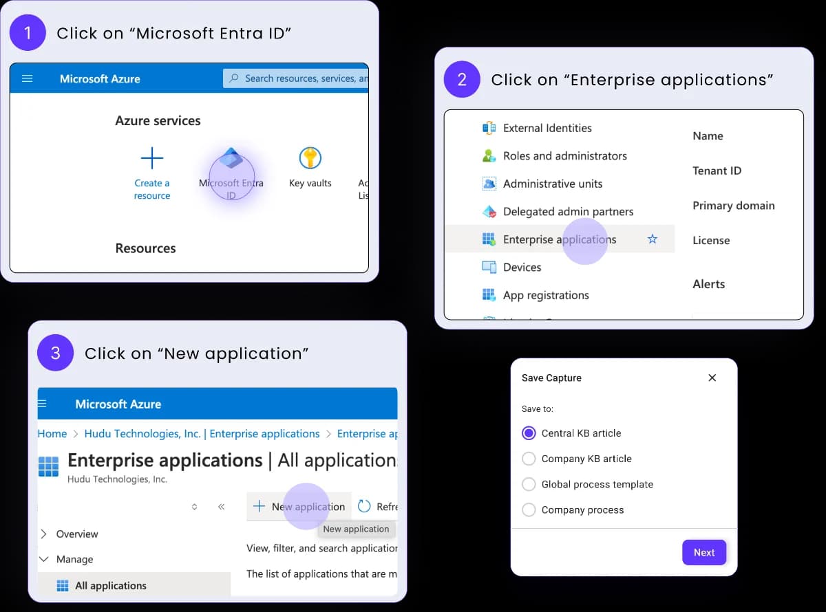
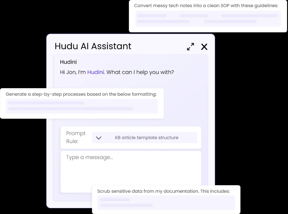
<BeforeAfter
  before="/assets/hudu/work-screen-capture.webp"
  after="/assets/hudu/work-hudini-ai.webp"
  beforeLabel="BEFORE"
  afterLabel="AFTER"
/>beforestringImage URL shown at split 0.
afterstringImage URL revealed as the split grows.
beforeLabelstringdefault "BEFORE"afterLabelstringdefault "AFTER"A compact dark banner pairing a circular avatar photo with a title/subtitle line and a bright pill CTA - drop it after a pricing or comparison section to route the reader to a named contact.
<AskExpert
  photo="/assets/testimonials/amerix-livio.png"
  title="Not sure where your contracts stand?"
  body="Send us your current price list. We will tell you what to keep."
  ctaLabel="Talk to us"
  ctaUrl="/contact"
/>photostringCircular avatar photo URL. Renders a bare placeholder circle when unset.
titlestringbodystringctaLabelstringctaUrlstringA two-competitor table with category group headers, five per-cell content types (checks, an "Advantage" pill, crosses, plain text, and a linked price), optional per-row info tooltips, and a footer CTA bar.
<FeatureComparison
  columns={[
    { name: "Hudu", subtitle: "Distributed by Halentra" },
    { name: "IT Glue", subtitle: "Alternative" },
  ]}
  groups={[
    {
      label: "Documentation",
      rows: [
        {
          feature: "IPAM",
          tooltip: "IP address management, built in.",
          cells: [{ kind: "check" }, { kind: "cross" }],
        },
      ],
    },
  ]}
  footerNote="Based on public pricing pages, checked June 2026."
  footerLinkLabel="Spotted something out of date?"
  footerLinkUrl="/contact"
  ctaLabel="Plan a migration"
  ctaUrl="/contact"
/>columns[{ name: string; subtitle: string; logo?: string }, { name: string; subtitle: string; logo?: string }]Exactly two entries. The first is the highlighted column - Halentra's own pick.
groups{ label: string; rows: { feature: string; tooltip?: string; cells: [Cell, Cell] }[] }[]Cell is one of { kind: "check" }, { kind: "check-advantage" }, { kind: "cross" }, { kind: "text"; text }, or { kind: "link"; text; href }.
footerNotestringfooterLinkLabelstringfooterLinkUrlstringThe inline footer link only renders when both footerLinkLabel and footerLinkUrl are set.
ctaLabelstringctaUrlstringA numbered walkthrough - each step gets a title and a description, with a screenshot underneath for the ones that need one.
Invoices raised in HaloPSA sync to Pennylane automatically, no manual re-entry.
Pennylane reconciles the incoming payment against the synced invoice.
Once matched, the invoice is marked paid on both sides - nothing left to reconcile by hand.
<Steps
  steps={[
    {
      title: "HaloPSA → Pennylane",
      text: "Invoices raised in HaloPSA sync to Pennylane automatically.",
      image: "/assets/hudu/work-api.webp",
      alt: "Invoice sync screenshot",
      maxWidth: 480,
    },
    {
      title: "Close the books",
      text: "Once matched, the invoice is marked paid on both sides.",
    },
  ]}
/>steps{ title: string; text: string; image?: string; alt?: string; maxWidth?: number }[]The badge number is the item's position in the array - image (and maxWidth, its cap in px) is optional per step.
A fixed-width screenshot with a heading and one paragraph of context, mirrored left or right down a long article. Stacks image-over-text on mobile.
Invoices raised in HaloPSA sync to Pennylane automatically, no manual re-entry. The screenshot sits beside the paragraph, and flipping `side` mirrors it into the other column.
<ImageText
  src="/assets/hudu/work-api.webp"
  alt="Invoice sync screenshot"
  side="left"
  title="What the handoff looks like"
  text="Invoices raised in HaloPSA sync to Pennylane automatically."
/>srcstringaltstringside"left" | "right"default "left"Which column the image sits in; stacks image-over-text on mobile either way.
titlestringtextstringA poster image with a play affordance over it; clicking swaps in the YouTube iframe, so page weight stays down until the reader asks for the video.
<Video
  youtubeUrl="https://www.youtube.com/watch?v=AuulayTFuRU"
  caption="Click to play - no autoplay on load."
/>youtubeUrlstringA full YouTube URL (watch/youtu.be/shorts/embed/live), not a bare video id.
captionstringRendered under the player when set, same optional treatment as other media captions.